Let’s say you’re browsing through your Facebook feed and see an advertisement for a 3 in 1 kitchen mixer that would be an absolutely perfect gift to give your mom. You click on an ad that takes you to a page on the company’s website with all the specs and uses for the mixer, which further convinces you to make the purchase. It’s quick and easy for you to find the “Add to cart” button and directs you to check out right in that same window. In the span of a couple of minutes, you’ve checked your mom off of your Christmas shopping list, and you didn’t even have to get off of your couch. That company utilized a landing page in conjunction with their social media ads to create a conversion that was as quick and seamless as possible for the user to make the purchase.
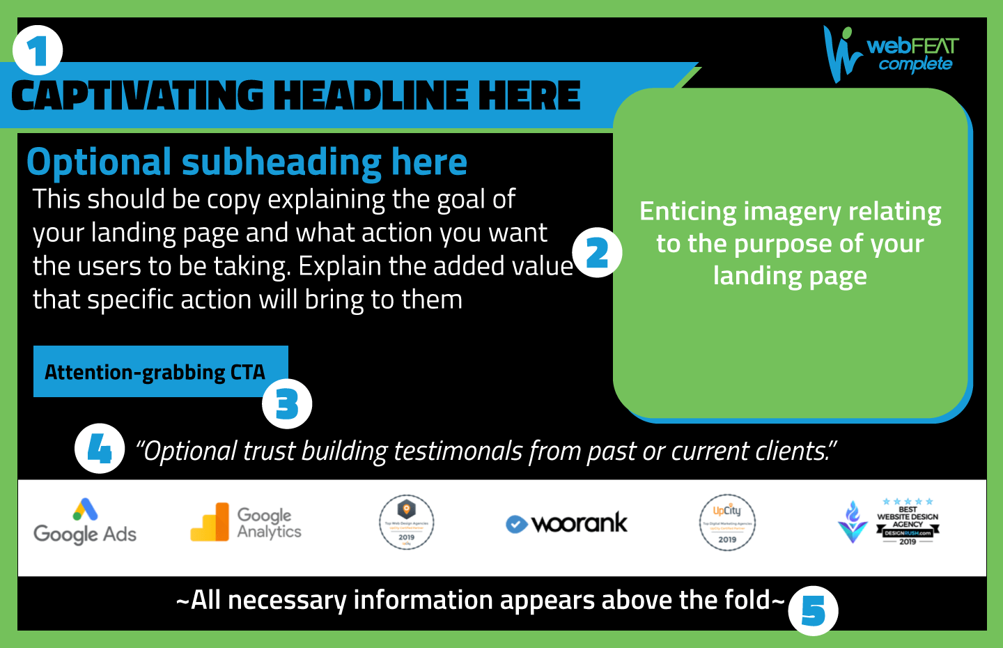
I put together an example of a landing page and then I’ll dive in and explain all of the purposes, benefits, and essential elements.


What is a website landing page?
A landing page is a page on your website that is built intentionally to generate a specific result. It is often linked to some sort of digital marketing campaign, such as a PPC ad, a social media ad, or an email marketing campaign. They have a singular goal and focus for the user to make a certain conversion.
For example, let’s say you are a company selling kitchen appliances, and you have an ad on Google targeting users searching for holiday kitchen appliance deals. Your ad for your 3 in 1 kitchen mixer pops up in their search, and they click on the link. Your website page that appears when they click on the link in your ad is your website landing page. For some companies, they simply direct users to a product page, or sometimes even the homepage. But the kind of landing page that sees those amazing conversions (that we’ll get to in a minute) are ones that are carefully and specifically achieving a certain goal.
This page on your website should have a specific goal in mind, and in the case of the kitchen appliance example, that goal is to sell people a 3 in 1 kitchen mixer. Instead of simply linking your ad to your mixer’s product page, you should link it to a carefully crafted landing page dedicated to selling your mixer. This can lead you to increased conversions because it allows you the opportunity to focus on the kitchen mixer and eliminate other distractions such as website headers, menu options, or other product offerings that can take away from the mixer. A website landing page can take the guessing game out of people viewing your website and should be specifically catered toward directing the users to take the exact action that you want them to take.
How landing pages are beneficial
Landing pages drive traffic to your website
Landing pages are typically used in various digital marketing campaigns, such as email marketing and PPC, that drive traffic to your website. You are able to reach a larger audience using various advertising methods targeted to the users you think are most likely to convert on the page. By directing them to a specifically tailored landing page, you are able to gently ease them down the sales funnel towards a more seamless conversion.
Landing pages help focus your audience
Because these website landing pages are specifically catered to one goal, it helps focus your audience on that one action that you want them to take. While the homepage and generic inner pages of your website encourage exploration throughout your entire website, the landing pages you direct them to focus on the specific purpose which helps increase the chance of conversions.
Landing pages can increase conversions on your website
The goal of your website is to provide users with information that leads them to convert. HubSpot reports that while websites overall have a typical conversion rate of 1-3%, landing pages typically have a 5-15% conversion rate. This is because, again, the users are focused specifically on the one action that you want them to take and the whole page is dedicated to convincing them to take that action.
Elements of a perfect website landing page
Website landing pages can be a great tool for your business. However, it won’t be beneficial to pick one page on your website that has a form and call it good to go. The landing pages need to be made with your intended goal in mind and they need to include some specific key elements in order to be successful:
- Concise and enticing headlines
- Copy & imagery to persuade a user to take action
- Bold and powerful CTAs
- Trust building elements
- Be simple and above the fold
Landing pages must have concise and enticing headlines
If the headline on your website’s landing page doesn’t immediately suck people in, it will be harder to narrow them down the sales funnel to encourage a conversion. The headline needs to clearly convey what action you want users to take on your landing page, while also enticing them to take that action. It is also helpful to supplement your main headline with a subheadline to further drive your point home. You also want to stay away from being too click-baity, and instead use your headlines to instill trust in you from your audience.
For example, with the 3 in 1 kitchen mixer, a good headline/subheading pair may look something like this:
15% off our kitchen mixer- it’s like 3 gifts in 1!
Give the gift of ease this season with our 3 in 1 kitchen mixer.
They should have a copy that is catered to the action you want viewers to take & imagery that relates
The copy on your website landing page is where you can really dive into what the value of your offer is and what your audience will get out of taking that action. Keep it short and to the point, and you can even use value-adding photos to help convey the message. Try to make the photos people-focused as that increases the likelihood of people connecting with your page. Like we explained in a previous blog: The magnetic power of people pictures is very useful in web design and can increase the chance of conversions.
They should utilize powerful CTAs that stand out from the rest of the page
CTA stands for call to action, and it leads users to take the specific action that you want them to make after viewing your landing page. This can be filling out a form, making a purchase, making a phone call- anything that leads the user to you. You call to action needs to be clear and powerful, and stand out from the rest of the page. A good way to do this is by using a big, bold button with a clear description on it, such as “Contact Us” or “Buy Now”. It doesn’t hurt to have the copy of the CTA branded to you. If you’re a more happy-go-lucky brand, using verbiage such as “Hit me up!” is great as long as it aligns with the rest of your marketing.
It is helpful to include trust-building elements.
Landing pages are a great place to include customer testimonials/logos, along with any certifications you have on the specific subject your landing page is about. This helps to establish you as trustworthy and a leader. These can be great ways to encourage a user who may be on the fence about converting, as long as you have the space for them and they flow well with your brand.
Lastly, they should be simple and above the fold
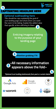
It is essential to make sure that the landing page isn’t overly cluttered. The end goal is for the users to know exactly what action they need to take and to be able to take it easy. Make it simple and to the point, and ensure that all information is above the fold. You don’t want users to have to scroll to find the information they’re looking for, because they are more likely to leave the page than they are to keep searching. Important elements that must be above the fold are your headlines, copy, and call to action. Feel free to reference our infographics at the top for a generic layout option, and take note that the mobile option is optimized to keep the important information above the scroll line on a mobile device.
Utilizing a landing page/multiple landing pages could be a very powerful tool for your business. If you’re interested in learning more about how to implement website landing pages into your digital marketing campaigns, reach out to our team. We would love to work with you on setting them up for you and propelling your business towards online success!
“”

