Website Design
Impress your prospects and drive results with an expertly crafted website.
Nearly 30 years of website design and development experience. Represent your business and effectively engage prospects. We specialize in WordPress. From basic 5-page websites to e-commerce buildout with international shipping and legal considerations. Hosting and Ongoing Website Management also available. Competitive pricing. Free Estimates.
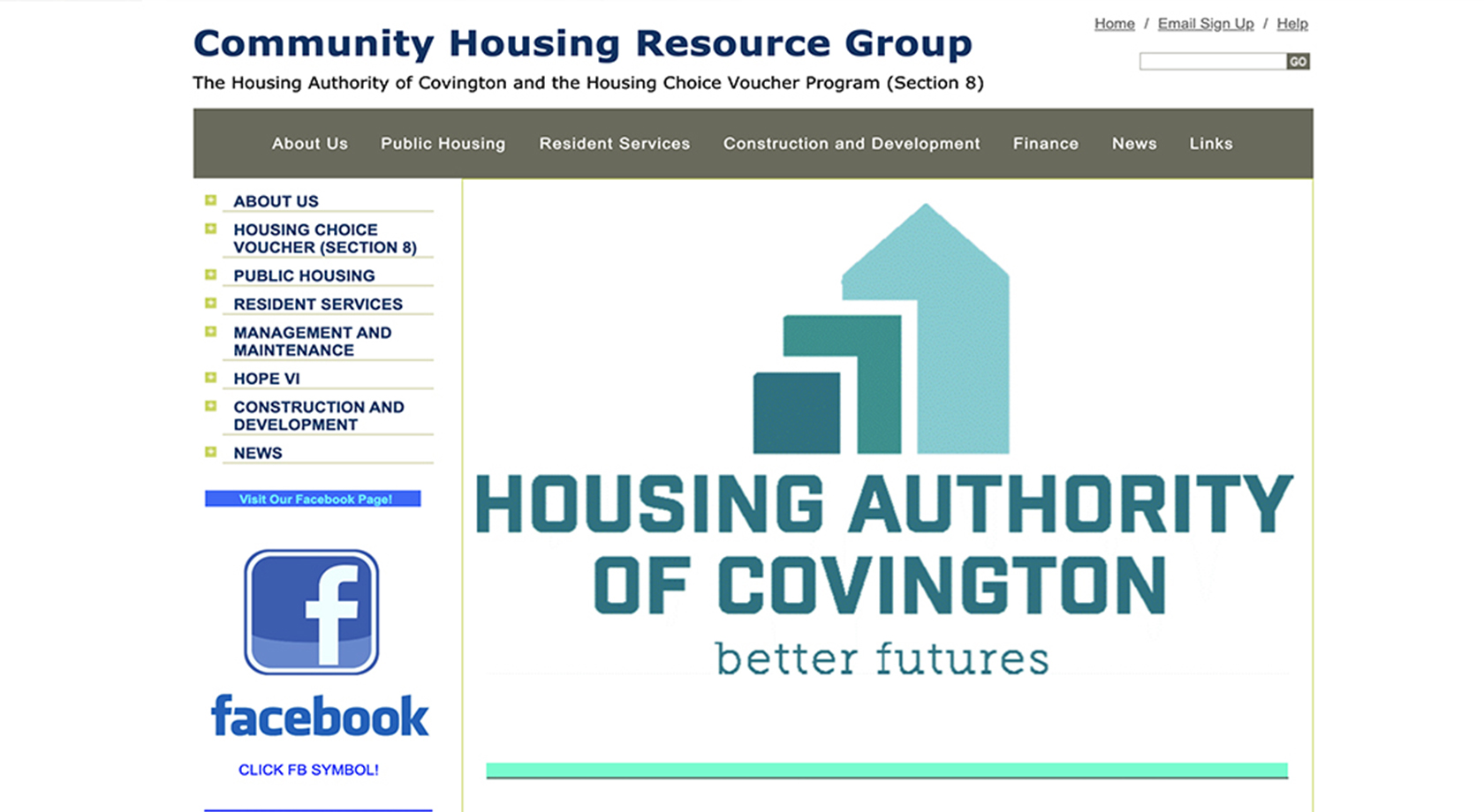
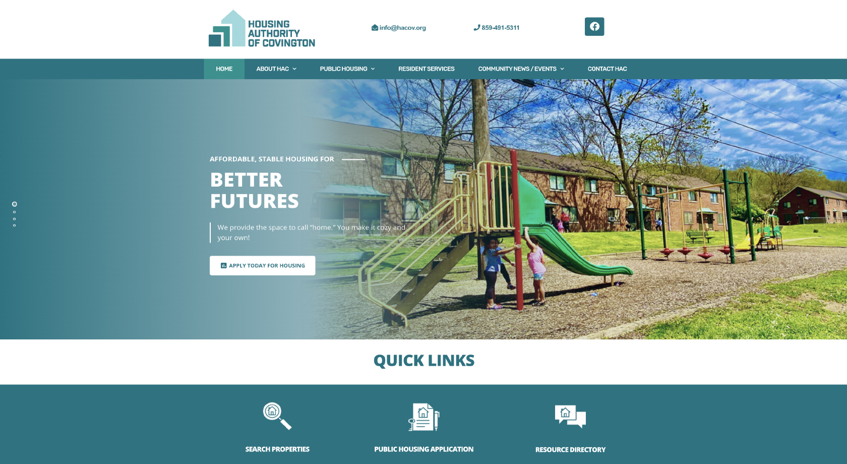
Explore our Redesign Examples and Portfolio.
Primary Service Pages or Email Marketing
We've been helping brands grow online since 1999.
Digital Marketing
Elevate your brand online with SEO, Google Ads, Social Media, Email Marketing, and other strategies that make sense for your business.
Website Design
Decades of web design expertise to help you craft an excellent online representation of your business. Hosting + Website Mgmt. available.
Our Portfolio + Results
Explore how we drive impactful results for our clients through tailored digital marketing strategies and tactics.





What We Do
Implement industry-leading strategies to boost your website’s visibility.
Implement industry-leading strategies to boost your website’s visibility.
Improve your presence in local search results to attract nearby customers.
Expand your reach across the country with targeted SEO Campaigns.
Ensure your website meets technical requirements for optimal performance.
Enhance user satisfaction by improving usability and accessibility.
Increase the percentage of website visitors who take desired actions.
Keep your website fresh and organized for better user engagement.
Earn high-quality backlinks to improve your website’s authority and ranking.
Analyze data to make informed decisions and continuously improve performance.
Ensure accurate information across online directories for netter visibility.
Enhance local signals and maintain consistent Name, Address, and Phone number information
Our Approach
We’ll gain a deep understanding of your company, its goals, and target audience.
Analyze competitors and search engine results to identify opportunities and challenges.
Define targeted keywords and audience segments to focus efforts effectively.
Utilize advanced tools and software to collect data and gain valuable insights.
Apply industry-leading techniques and methodologies to optimize your website.
Focus on enhancing critical performance indicators to drive success.
Create valuable, relevant content that meets the needs of your target audience.
Ensure that your website meets search engine requirements for optimial visibility.
Increase visibility by ranking relevant keywords in the top five pages of search results.
Attract high-quality visitors who are most likely to engage and convert.
Drive actions that align with your business objectives, such as form submissions or transactions.
Continuously monitor performance, make improvements, and manage growth to ensure long-term success.
How This Helps You
Boosts your website’s visibility and rank higher in relevant search results.
Increases your visibility and helps you reach a wider audience.
Enhances the user experience of your website, making it easier for visitors to navigate and find what they need.
Convert more visitors into customers, leading to higher sales and revenue.
Gain measurable results that demonstrate the value of your digital marketing efforts.
Set the foundation for your business online. Stand out from competitors and establish your brand as a leader in the industry.
Expands your online presence and helps your reach more potential customers.
Helps your site attract relevant, high-quality traffic that is more likely to convert.
Generates more leads for your business, leading to greater opportunities for growth.
Ultimately, our services will help to drive more revenue for your business.
Drive actions that align with your business objectives, such as form submissions or transactions.
Nearly 30 years managing websites.
We’ve been providing website design services for nearly 30 years. We have 85+ years of cumulative digital marketing experience, and love helping businesses achieve success online.
